Graphical interface
A shaped emotion, a message in a well-defined system
Let me introduce myself. I am an Interface Designer at Yandex, and I've been involved with projects like Yandex.Maps and Search Engine Results Page, and also designed brand icons, promo materials, documentation, a project planner, a shared interface component library, and a fast prototyping system. Besides that, I follow my colleagues' projects such as Yandex Main Page and other Yandex portal services: Market, News, Images, Video, Disk, Auto, Realty. I see how these projects grow and evolve.
After some time, I drew certain conclusions from this process, and decided to share those of them which were proven by stats and numbers. This is an overview, focused on these questions:
- Should an interface designer be able to draw and work with fonts?
- Should designers work on texts themselves?
- Is it necessary to code and do HTML/CSS?
- How interfaces should be evaluated?
Before we dive in, here is a couple of common term definitions:
Interface is a model of interaction with a product.
Designer is a person who defines interface type and content.
Examples of interface types:
- graphical
- programming
- command line
- voice interface
The graphical interface is what we are discussing.
I'd like to emphasize that "interface" does not equal "buttons", and "designer" is not an antipode of "developer".
An extra note: I can't say I read lots of books on the subject, I don't have a degree in arts; nonetheless, design is how I earn money since my university years. Therefore my experience comes mostly from practice and observing the world around me.
Shape
When I was a kid, I saw drawing as a process of projecting images out of my head onto a piece of paper. Later on, when I started copying images from comic books or drawing things I saw around, the process of drawing became a practical skill of observing and correctly measuring various object details.
It didn't take me much time to understand the true value of form, but it wasn't until much later that I started paying more attention to color. Still being a schoolboy, I drew cartoons in Flash together with a friend, who criticized me for using a primitive color palette, such as #F00 for red or #0F0 for blue. I can't imagine myself doing that now, but at that time I was quite content with those acid colors — in fact, a mere color abbreviation: "this is blue", "this is red". I prefer to blame the default (ordinary) Flash editor palette, as it didn't inspire one to look for new and uncommon color combinations.
A couple of drawing lessons would have done me good. I could have learned about the color wheel and HSV-model. Unfortunately, I didn't have time for that, so I learned about colors in my physics class at school while studying stuff like light wave spectrum. A special thanks goes to my friend, too.
An interface example from my first job:
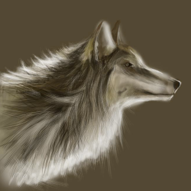
For some time I was even considering a career in illustration. For that purpose, I downloaded all the issues of the 2D-Artist Magazine, and went through drawing tutorials step-by-step: fantasy, anime, animals with thick fur, snow on the tree branches, and many others. This isn't too hard when you get to drawing your 10th wolf or 20th tree. Drawing something out of your head is much more difficult — one needs practice, a lot of it.
Experimenting with Photoshop brushes:
Finding my own style:

However, I didn't earn my first money by drawing stuff. I got paid for designing a web interface for a popular science portal, Whoyougle — quite a quirk of fate, wasn't it? That helped me shift my focus towards what I still do these days.
The above-mentioned interface: visual dog breed selector

I didn't stop sketching, but it became more conceptual: icons, schemes and various constructions composed of different shapes.
Yandex services' logos and icons: pieces of a unified ecosystem
A MacOS browser fantasy:

A shaped emotion. A message in a well-defined system.
So, as a visual designer, do you need drawing/sketching skills? This is how I would answer this question: you have to feel shape and form to find effective means of expression for a given context and expand those to a broader set of cases. I think I didn't learn how to sketch properly, but I can "catch" the shape I need — sometimes, after a dozen cmd+Z keystrokes.
If foundation of a product form was laid out by someone else, do not start thinking about rebuilding it all from scratch, but rather try to understand the system and see if you can carry on with it. The same, I think, applies to interior design: you don't have to create the items yourself, yet finding a balanced combination is essential, as well as extending the existing combination whenever necessary.
Google's brand action buttons:
The Like icon uses a recognizable shade of blue and familiar Facebook style

Yandex.Money logo: as sharp and yellow as the search form on its main page

A Windows 8 logo is an introduction to the OS style

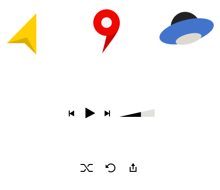
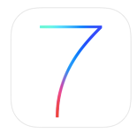
All visual features of iOS7, packed into one icon
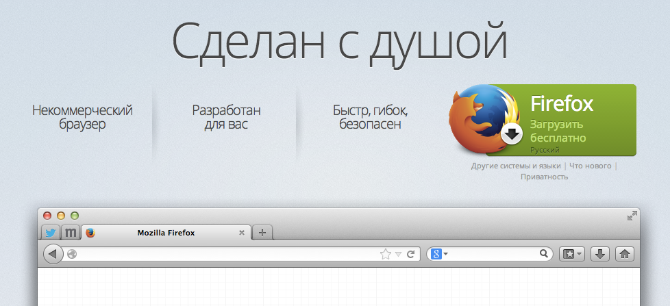
Form expresses the mood of an interface, its own nature. Form is a "coordinate system" in which the means of expression must evolve. It shapes the first product impression and leaves a distinctive footprint in memory, thus being a valued characteristic of any product.
Color is a detachable part of the form. It emphasizes the unity of various elements on the screen, highlights key points, creates a recognizable image. Color is usually extracted from a logo or a predominant visual.


Font is also a form, and that means it can be unique and important asset of a product.
VK.com chose the "system" Tahoma font that is seldom used on the Web, and those recognizable small letters got associated with their product.
Had they chosen Arial instead, the set of unique features could have been less pronounced:
MacOS interfaces are instantly recognizable thanks to rounded lowercase letters and contrasting capitals of the Lucida Grande font:

I'm pretty sure anyone would recognize this OS thanks to Roboto:
Hint: "A" is the first letter

My colleague cracked a joke once: "In our ads, we put bare text where others would place a naked woman". The Textbook font face had been associated with the Yandex brand for quite some time.
In other words, even non-designers associate a font with a brand. The shape of letters is equally important as the logo shape or color; when a logo drops out of sight or brand identity color can't be used, we still have the font.
Why do I put so much emphasis on the product identity? All these properties — form, color or font — define frames and guidelines one should follow to make the product stand out in the market. They help us avoid stylistical uncertainty and focus on the content.
Content
Any interface is also an element hierarchy. Using shape, size, color, alignment and context, we separate primary elements from secondary ones, content that can be omitted from content that deserves user's attention.
Text also has a hierarchical structure: headings, subheadings, paragraphs, nested lists. Inside any text, there are more important and less important things. Many actions applicable to an interface can also be applied to texts: we can improve it, make it comprehensible, more interesting, shorter, disambiguate it etc.
Text is a special case of a data model, and a data model is used to build an interface around it. Let's make one step back to see how the product visualization process happens. Here's a simple example: an interface for a new e-mail message form. We start by formally defining the incoming data model:
Message
  From
    address
  To
    address1
    address2
    ...
  Copy
    address1
    address2
    ...
  Subject
  Date
  Content
    Text
    Images
    ...
  Actions
    Translation
    Options
The interface is built on top the data. There is one model with multiple possible representations. One of those is, in our case, the new message form:
"From" and "Date" fields were put aside, and "CC" was moved into Options. Using the same model, we can create a couple of extra representations: the message itself, and its shortened version in the thread selection column.
Thus, designer has to study the data model thoroughly before starting to create a representation (interface).
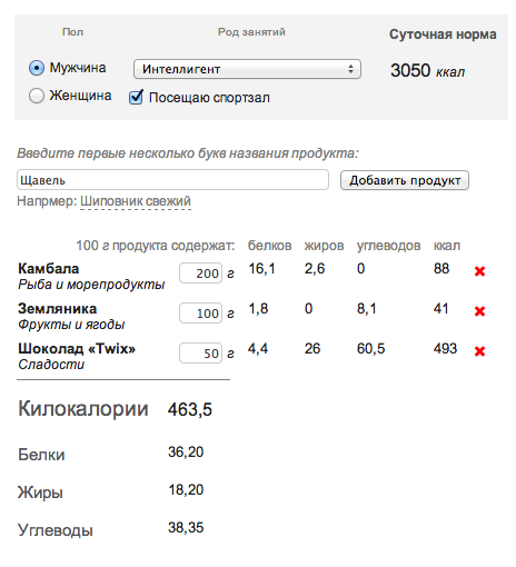
The statement above may sounds unconvincing as the supporting example is quite primitive. Here is something else. I've already mentioned that I worked for a popular science web resource as a developer and, later, as a designer. During that time, I had to read many articles on nutrition and diets, and collect the necessary data about 360 essential products, only to create this nutrition calculator.
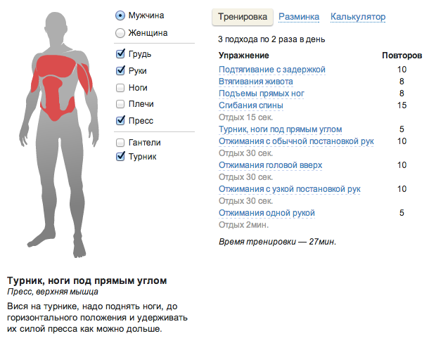
To design an online fitness guide, I had to read a small book on physical excercise.
The model of incoming data is often poorly or vaguely defined, and it's a designer's responsibility to formalize and finalize it.
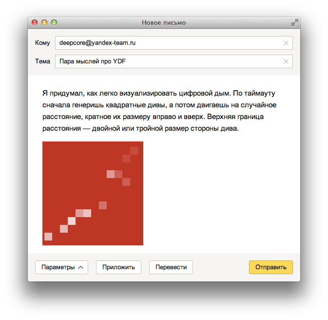
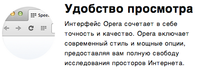
For a promo screen, input data is the marketing idea to highlight certain product features, or change the way customers perceive the product. It would be a terrible mistake for a designer to create a so-called "draft design" which is filled in with text later — most likely, by a third party. Designer and copyrighter have to work together, combining words and graphics into a holistic experience, so that the result looks like this:

...and not like this:
The whole Internet is filled over with the same layout ("image + text"):

The designer's creativity can transform this info something bigger and better:


...or not:

System
Not every designer had that experience of providing long term support for a complicated product. Even less people can claim they helped shape the initial idea from the very beginning. This is probably the reason why the systematic approach (one that involves data structures, logical schemes, complicated prototypes) doesn't have that much credibility or support.
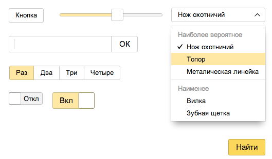
How many designers would be able to list all the types and states of the buttons they're using in the interface they work with? Can they remember the sizing scale: what is the height of a small button, a medium one, a large one?
I always liked to play with Lego pieces, trying to combine then in different ways. Sometimes it looked like its creators themselves didn't know all the possible combinations but just followed a set of strict rules, and because of that, those pieces of plastic are interlocking in many different combinations, allowing for infinite number of complicated objects to be built from a finite set of simple elements.
How did I connect this Lego principle with the interface domain? Here's a simple button:

The button has states, a lot of them:

The systematic approach has a feature: in the very beginning, you have to work a lot, to get plenty of bonuses later.
From several buttons glued together one can assemble a radio group:
The dropdown list is a special button type:
A slider is made from that very button:

A switch is a white button inside a checked button:

Checkbox is a checked button with a tick:
Compound elements evolve from simple ones (another simple element is a text entry field). This is how you get a search form:

A combobox:
A payment form:

Sometimes we have to highlight a form element (e.g. to point out an input error). A contrast popup can be used for this:

A sizing scale has been defined before: 24, 28, and 32 px. All the controls (from a button to a slider) have this height already, and it would be logical to have popups aligned along the same scale. Thus, popups in a form, even if displayed next to each field, won't conflict with each other, and all the elements will align themselves horizontally and vertically.
Element paddings can also be defined within the same scale. I set those to be either 6, 10, 16 or 20 px, so that each of them is divisible by two.
On the one hand, this keeps yourself organized and helps a lot. On the other hand, as the system grows, means of expression also grow, more elements and modifications are added, connections between elements become complicated, and the model gets more difficult to maintain. These details are too subtle; graphic editor software won't take care of that, so a lot has to be kept just in your head. Communicating the system to another person is hard as a lot of details are hard to explain or simply get lost, and after some time, you the designer start forgetting about some of those details, too.
I'll explain once more why it is so complicated. Imagine a search interface that has to give an answer to any query or question. That answer comes not as simple hyperlinks or text, but as objects, video, music player, images, maps, phone numbers and addresses, goods with price tags and "buy now" buttons, ads, forms, calculators and converters, graphs and counters. Now imagine that every answer is interactive: you can touch it and it expands, or shows a new block on the side. This is only the main search interface. There are also specialized search interfaces for video, images, music, maps, goods, people, news, dictionaries, cars and so on — all these have to work in a way similar to the main search, but also add some unique features and experience. There are also standalone services which have to look and feel like the main search, but... at this point you've got my idea, right?
An instrument is needed that would allow for controlling the system without exponentially increasing the price of adding new components. However, Titanic (for example) was perfectly controllable — without much success. Actually, I prefer the term "juggling" instead of "controlling".
I see my colleagues constantly looking for a silver bullet in a graphical interface. In inDesign, one finds text style classes; Axure allows a prototype to be built from a series of screens; Sketch supports object libraries and builds screens from object copies. Each tool reaches its limits sooner or later: an editor won't support behavior definitions, and a prototyping environment won't have support for an object library or any other dynamic actions except for switching between the screens.
Instead of those limits, I see endless possibilities as vast as the outer space. The closer to the stars I fly, the bigger the universe seems to be. The first insight happens when you learn HTML. Working with lists, huge texts and tables finally becomes comfortable: there are many settings to play with to achieve the ideal balance, test various representations with different data and minimal effort.
During interviewing and hiring process, we at Yandex sometimes ask people to send us a prototype of a beautiful table representing data on 170 employees or a couple of documentation pages with paragraphs and subsections, code examples, lists, method tables and other formatting. Some candidates manually arrange 170 portraits in Photoshop, to make it look outstanding, other ones write a script to fill the same layout with different data on 170 people from their Facebook friend list. These two kinds of candidates are equally interesting for us.
Are you sure your project won't grow to that level of complexity? Should you avoid this complexity at all, or is it a just a level-up? How could you be possibly sure that your project won't get two dozen extra screens in a couple of months? If you work with a flow of similar clients (corporate clients, for example), do you ever consider factoring out common interface elements? Did you ever trust a different designer on your team with creating some follow-up screens for your own project?
I won't be showcasing examples of code that save hours and hours of manual work, as sharing another link to CSS and JavaScript resources these days is redundant, to say the least. What I'm trying to emphasize is that this might be the new perspective, the new way to expand your knowledge and expertise. Learn development tools not to prove that you are smarter then other, not to aquire another skill, not to understand programmers' humor better, but only to hit the limit and break out of it, into the outer space of possibilities.
Critics
How would you recognize a good design? I already mentioned some of the key factors: clear and emotionally defined form, visual language, systematic approach. Each of the factors has to follow the product's goal. A good design features unified, carefully chosen and well-integrated forms where key points are highlighted by means of words or shapes. As a result, the message should be clear and comprehensible.
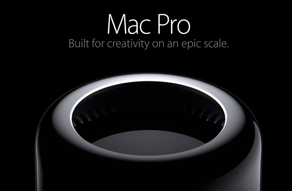
This is a thing from another planet, it does magic: http://www.apple.com/mac-pro/
Loosen reader's critical filters before he starts reading the article: http://w-o-s.ru/article/8597 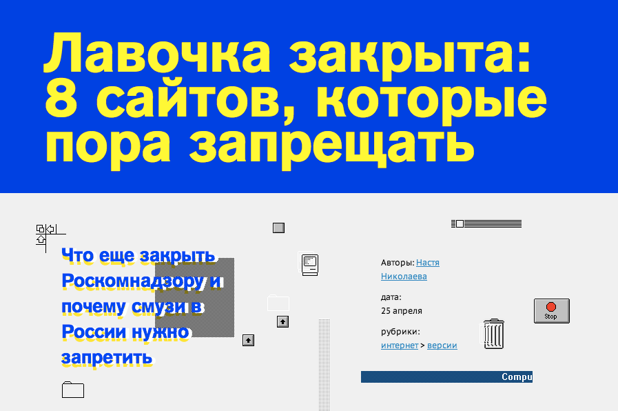
We've got a visitor, now engage him — at any cost, so shoot with all the guns: https://www.facebook.com/ 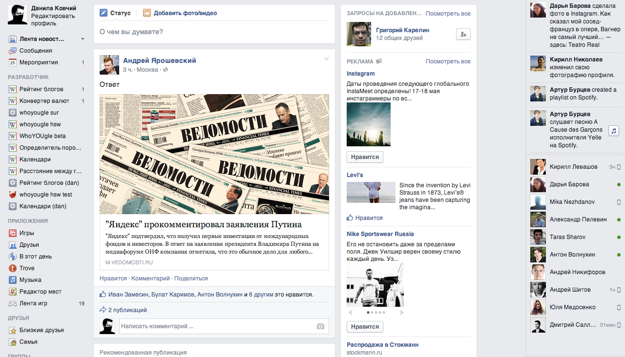
We have a lot of music for you, please enter: http://zvooq.ru/ 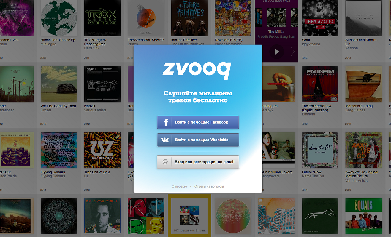
You are about to finish with this one, we have similar stuff released this year: http://www.youtube.com/watch?v=VCTen3-B8GU 
We know so much more... feel free to ask! currency exchange rate 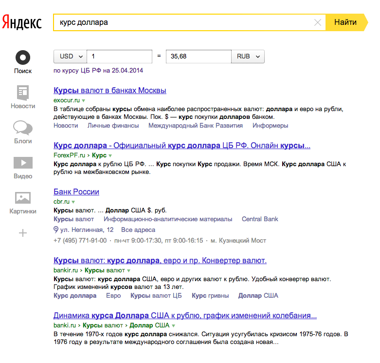
Let's see some pictures; we promise you won't get bored: http://www.pinterest.com/ 
Just point your finger at the style you like: http://bangbangstudio.ru/illustrations 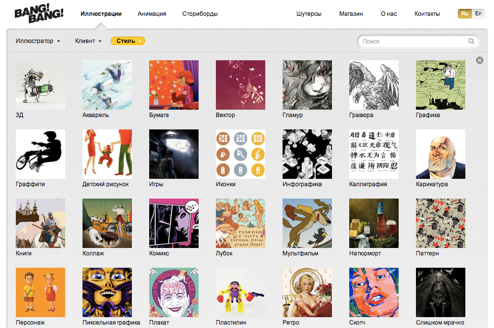
If you see another beautiful bulding in Kiev, it's likely we who built it: http://www.zhytlobud.com/ru/buildings/kiev/ 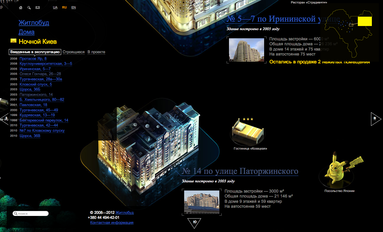
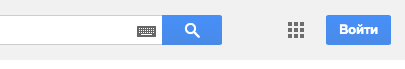
You just saved one hour of your life: http://www.yandex.ru/ 
That's it.
I hope you learned something new about interfaces and things we do at Yandex, and also about things my colleagues around the world do for other projects. I hope you find it interesting.
Other Popular Articles
- What Every Frontend Developer Should Know About Webpage Rendering
- Top JavaScript Development Companies
- Top Angular Development Companies in 2022